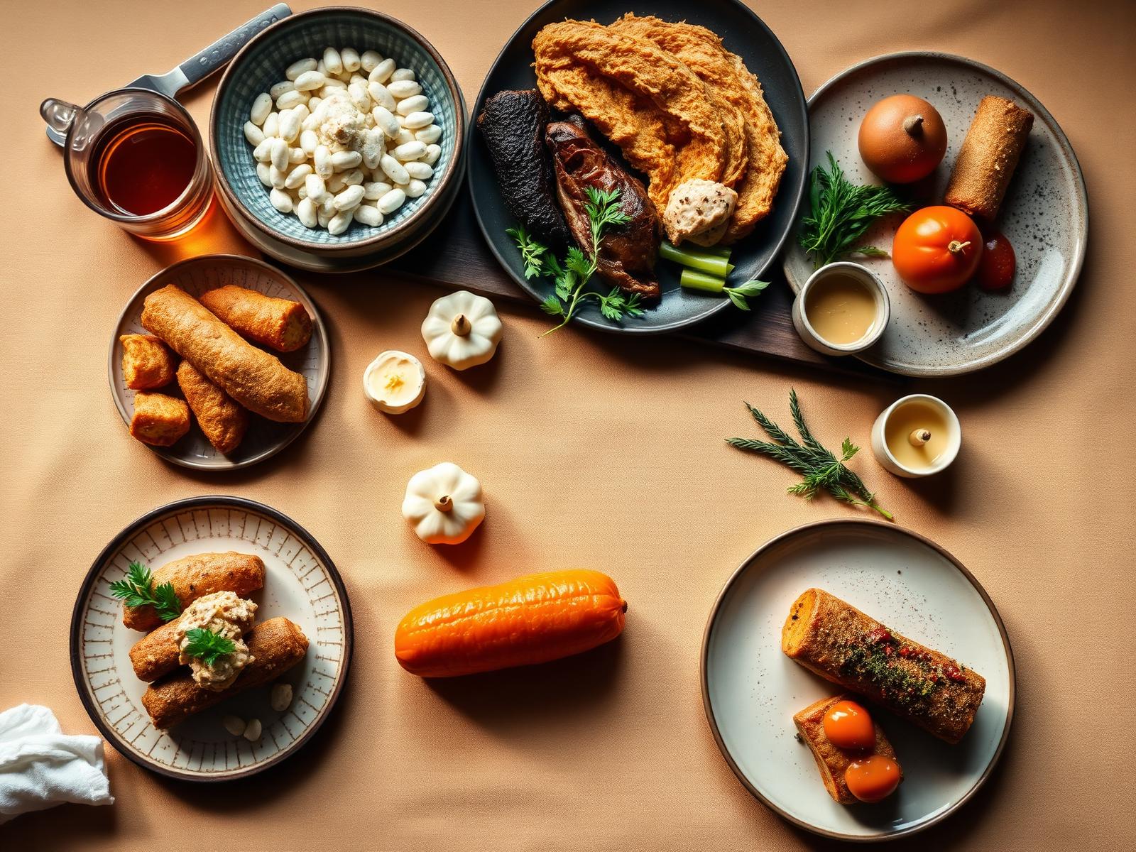
Delicious Food.
Delivered Beautifully.
A premium food delivery experience crafted with modern UI principles and exceptional user experience — presented one screen at a time.
First impressions, crafted in a heartbeat.
A signature orange gradient, a soft breathing logo and a whisper of motion. The tone is set before a single tap.
Three screens. One feeling.
Editorial food photography paired with elegant, minimal copy. No walls of text — just a gentle invitation in.

Discover the finest
flavors nearby.
From cozy neighborhood kitchens to Michelin-loved staples — one elegant app.
Sign in without friction.
Apple and Google front-and-centre. Glass surfaces, luxe shadows and a single, unmistakable primary action.
Welcome back
Sign in to continue your delicious journey.
Discover the finest
flavors nearby.
From cozy neighborhood kitchens to Michelin-loved staples — one elegant app.
A dashboard that feels like a menu.
Greeting, address, discovery — all breathing on a warm surface. Every card is edible.
first order
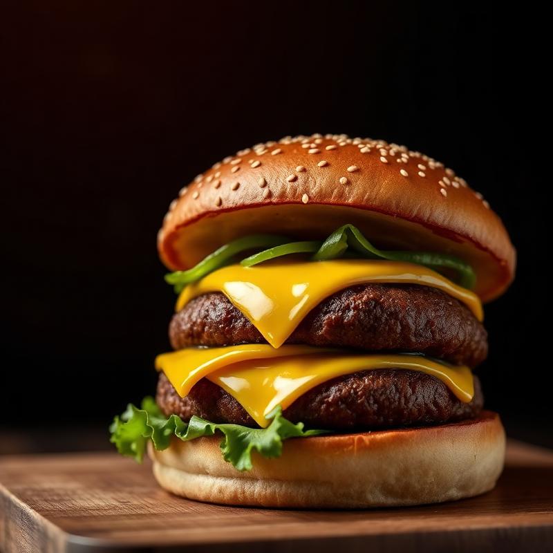
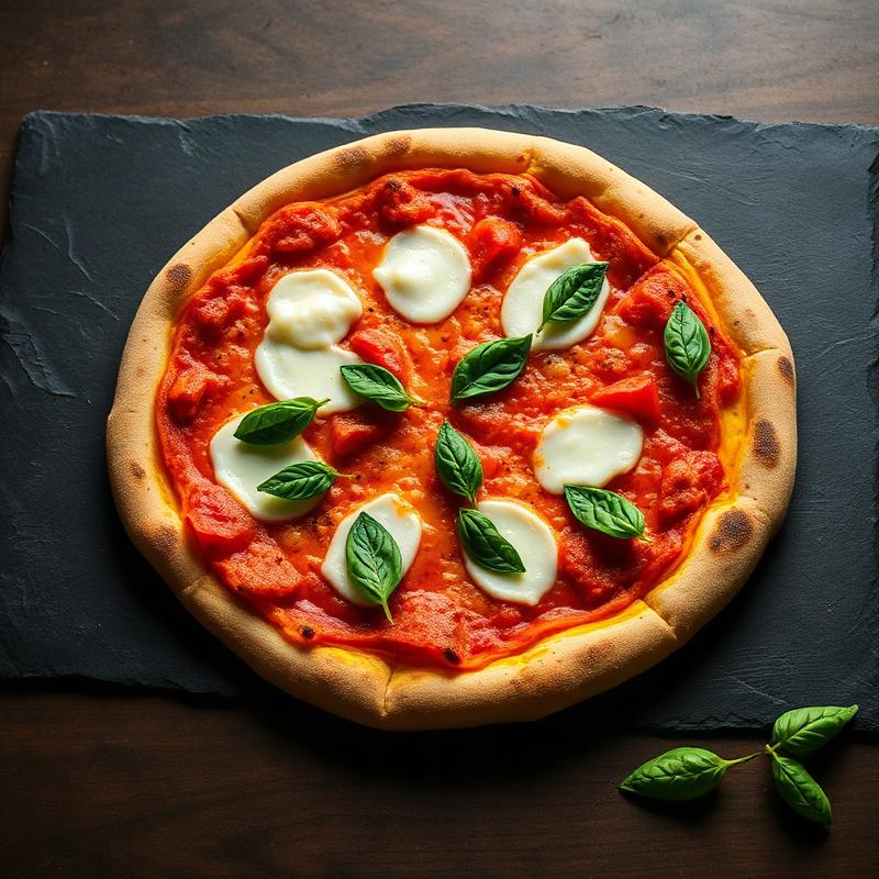
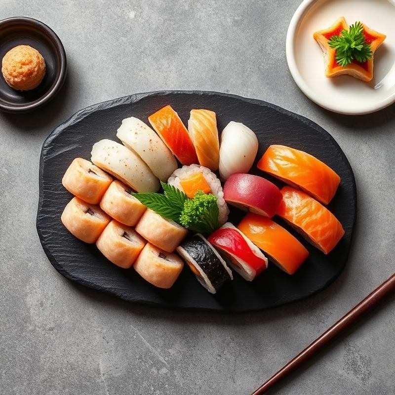
Every feature, quietly considered.
From craving to cart in three taps.
Restaurants surface with rating, distance and delivery ETA. The detail sheet is a cinematic reveal — food first, controls second.
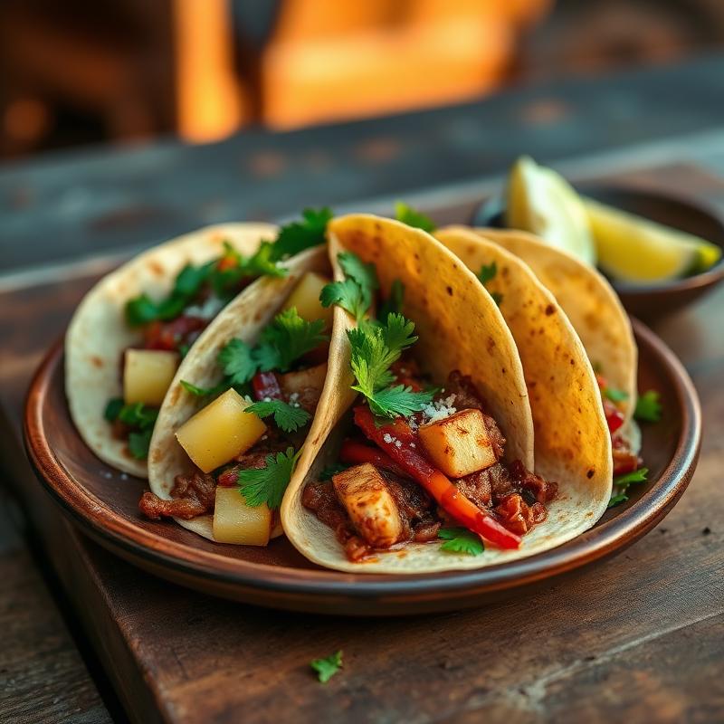
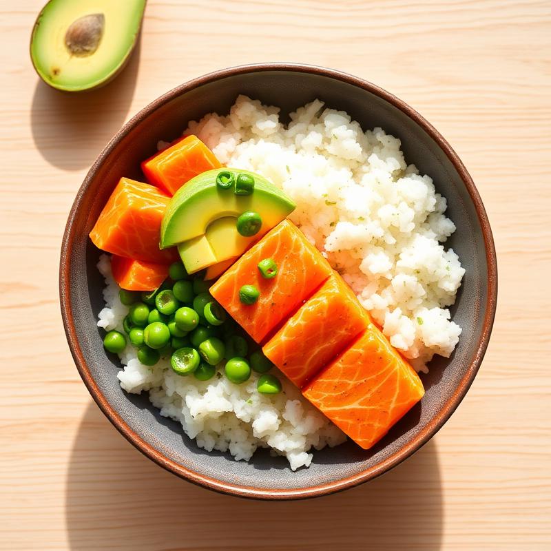
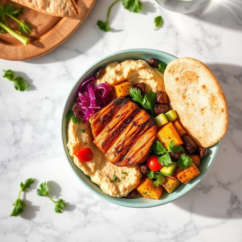
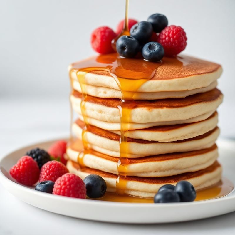
Every line item, quiet and clear.
Coupons apply with a soft glow. Totals land in a floating card that never fights for attention.
A checkout that trusts the user.
Apple Pay, Google Pay, card. Three inputs, no dead-ends, one primary CTA.
Watch it come to you.
Interactive map, live courier card, timeline. The order is a story, not a status page.
Celebrated, never shouted.
A gentle pulse, a warm confirmation card, and two clear next steps — Reorder or Rate.
We'll notify you at every step.
History, favorites, notifications.
Everything the diner has loved, in one calm place. Cards remember; the app doesn't nag.
A profile that respects the human.
Gold tier, points, addresses, payments — organised in the shadcn-style rhythm we use across every screen.
One system,\nfifteen screens.
Colors, type, radius, elevation and motion — all inherited from a single source of truth.
Designed for modern food experiences.
QuickBite combines elegant design, intuitive user experience and modern interaction principles into a premium mobile application concept.
first order